Views: 1
Are you trying to figure out more effective ways to reach your customers? Don’t guess, you need to test. Split testing which is also called A/B Testing and it’s a great way to understand your customers much better. These tests give you the opportunity to compare two different variations of the same element in your online marketing to see what your audience responds to best. Then you can create a much more effective web presence, email campaign or an online sales pitch.
Split testing sign up forms

Sign up forms that break the mold
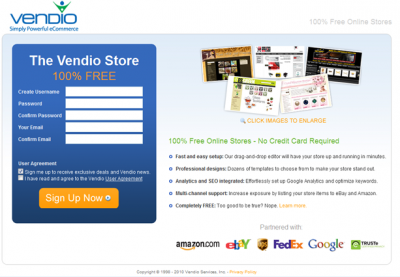
Putting an email sign up form on your home page is a very common tactic to get leads. It’s pretty intuitive, a visitor comes to the page, likes what he/she sees, types in their info into the sign up form and goes back to what they were originally there for all without getting derailed by extra steps in the sign up. Just because a sign up form is simple to set up doesn’t mean it’s the most effective way to get people on your list. Vendio which is a commerce site had a basic form on their homepage that looked like this:
 They weren’t happy with the conversions, so they tested this out:
Even with the click to sign up, the response rate went up 60% with the new design. It was easier for visitors to understand the service being offered to them without the sign up form drawing their attention immediately. They were more likely to go to a new page to sign up once they knew more about Vendio. As we can see from this example, a less conventional style can perform better than something standard but Vendio only found this out with split testing.
Grow your list with a lightbox
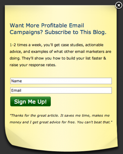
Popup forms are another common way to get leads. I know some people are annoyed with popups. Split testing allows you to find the most effective or the least annoying way to do it. Check out AWeber’s lightbox sign up form on their blog:
AWeber split tested the form to find the best way to implement it. They left the form exactly the same and decided to test the time that elapsed before it opened up. The tried 30, 45, 60 and 75 seconds. After a couple thousand visitors, they found that 45 seconds was the best delay. They received 45% more conversions with 45 seconds than 30, 22.5% more than 60 and 52.5% more than 75. The lightbox only pops up for people viewing it for the first time only to minimise annoyance.What else should you split test?
It’s not only sign up forms you can test. You can split test everything including:
- Testing your subject lines to get more email opens.
- Test your link text to get more click throughs.
- Test your images, layout, word choice, fonts, the possibilities are endless to make your emails more visually appealing.
For now, start split testing sign up forms. Then when your conversions improve, you can split test other things.

